
If you manage a space where the public visits, you’ve heard it a hundred times: “Where is the washroom?” “Which way is reception?” “How do I get to Suite 200?” Even with signs on the wall, people still get lost.
That’s the real job of wayfinding signs. They reduce confusion, lower stress, and help people move through a space without needing staff to guide them.
This article breaks down seven common problems that make wayfinding fail. It also explains practical fixes that reduce repeat questions, protect your brand image, and help signage last longer.
What people mean when they search “wayfinding signs”
Most searchers are looking for one of these outcomes:
- A clear plan for directional signage in a building, campus, or public space
- Tips for improving readability, placement, and consistency
- Better materials that won’t peel, fade, or look temporary
- Accessibility guidance so signage works for more users
A well-known example of a city-scale wayfinding system is Legible London, which uses a consistent visual approach across London to help people navigate on foot. It’s a helpful reference point when you’re building consistency, even at a smaller scale.
The 7 most common wayfinding sign problems
1) People still ask for directions
You put signs up. People still ask. That usually means the signs are either not being seen, not being understood, or not appearing at the moment someone needs them.
Common causes:
- The sign is too small or too high
- The message is too wordy
- Arrows are unclear
- The sign is placed after the decision point instead of before it
Quick fix ideas:
- Use fewer words and bigger type
- Use consistent arrows and simple destination names
- Place signs where decisions happen (turns, splits, entries)
Result you’re aiming for: fewer interruptions, smoother traffic, less frustration.
2) Inconsistent signage creates mixed messages
A classic problem is the “patchwork system.” Some signs are branded, some are handwritten, some are printed on paper and taped up, and some are old but still visible.
That inconsistency makes people second-guess directions. It also makes the space feel disorganized.
Signs become inconsistent when:
- Different teams order different styles
- Tenants add their own signs
- Temporary event signs never come down
Practical fix ideas:
- Define one visual system (fonts, colours, arrow style, naming)
- Standardize templates for common sign types
- Remove outdated signs the moment updates go live
Small change, big impact: consistent design reduces hesitation. That saves time for visitors and staff.
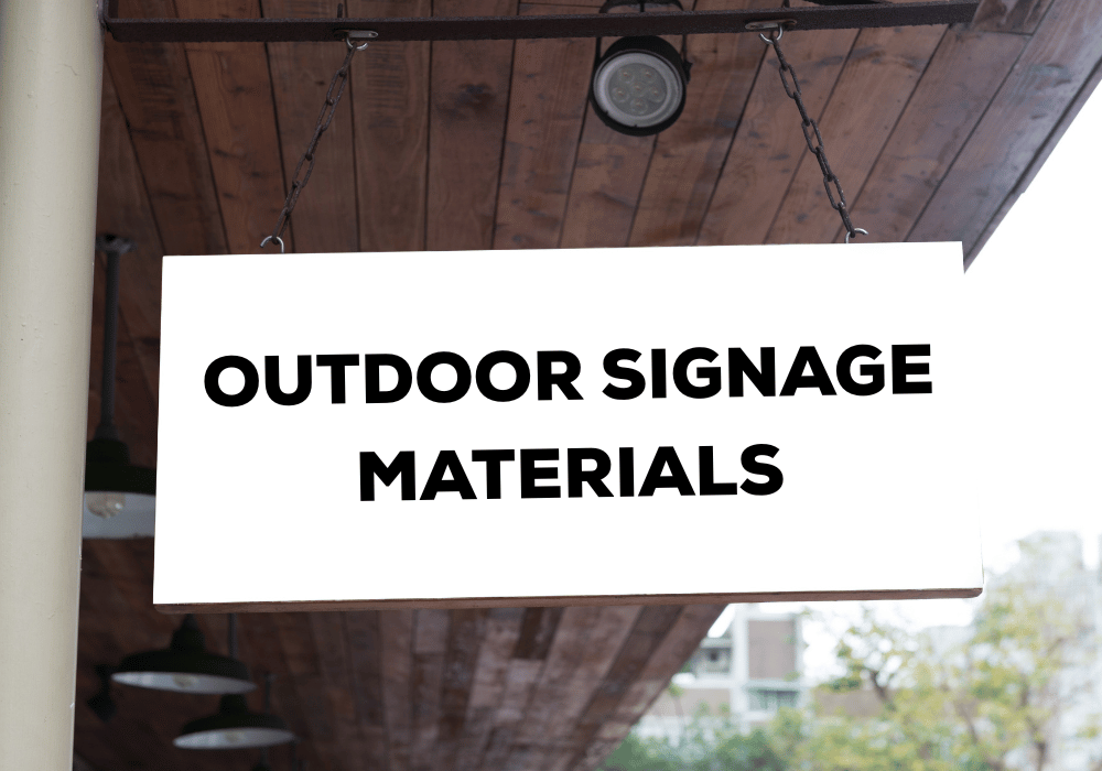
3) Signs don’t hold up in real conditions
Low-quality signs fail quickly in the real world. Corners curl. Adhesives let go. Colours fade. Surfaces scuff. In winter, moisture and temperature swings can shorten a sign’s lifespan.
This happens most often with:
- Low-tack adhesives on high-touch areas
- Thin materials on uneven walls
- Outdoor pieces without weather-ready substrates or laminates
Practical fix ideas:
- Match materials to the environment (indoor, outdoor, high traffic)
- Choose finishes that resist scuffs and fingerprints
- Use mounting methods that suit the wall surface
If you’re tired of replacing “temporary” signage every few months, durability is the fastest way to cut ongoing costs.
4) Poor readability at a distance
A sign can be technically correct and still fail if it’s hard to read quickly.
Readability problems often come from:
- Low contrast between text and background
- Type that is too thin or too small
- Glare from shiny finishes under strong lighting
- Too much information on one panel
Practical fix ideas:
- Prioritize contrast and legible type
- Increase type size for corridor viewing distance
- Use finishes that reduce glare in bright areas
- Break information into a hierarchy (primary destination, then details)
For accessibility, contrast and clear typography matter. Ontario accessibility guidance and best practices commonly emphasize legible sans-serif type, tactile and Braille where required, and good colour contrast for usability.
5) Bad placement and missing decision points
Placement is as important as design. A perfect sign in the wrong spot is basically invisible.
Typical placement issues:
- Signs are hidden behind doors or plants
- Signs appear too late, after someone has passed the turn
- No confirmation signs, so people doubt they’re on the right path
Practical fix ideas:
- Add signage at entries, intersections, and elevator lobbies
- Use “reassurance” signs down long corridors
- Walk the route like a first-time visitor and note where you hesitate
A simple walkthrough with fresh eyes often reveals why people keep asking the same questions.
6) No system for updates, tenants, or events
Spaces change. Tenants move. Departments rename. Room numbers change. Without a system, signage becomes outdated fast.
Common symptoms:
- Old destinations remain on signs
- Staff give directions that contradict signage
- Event signs are inconsistent and confusing
Practical fix ideas:
- Use modular or update-friendly sign systems where possible
- Keep a master list of destinations and naming rules
- Set a process for approvals so updates stay consistent
Goal: signage should be easy to maintain, not a full reset every time something changes.
7) Accessibility gaps cause barriers
Even if your space feels “easy enough,” accessibility gaps can create real barriers.
Examples:
- Low contrast for people with low vision
- Sign placement that’s hard to reach
- Lack of tactile and Braille where needed
- Too much information for quick comprehension
Canadian accessibility work highlights the importance of comprehensive wayfinding and multi-mode communication (visual, tactile, audio where needed) for outdoor spaces and facilities.
Ontario’s accessibility discussions also continue to push for stronger built-environment signage standards, including improvements tied to tactile and Braille use.
Important note: Requirements vary by setting and project type. For compliance-critical spaces, confirm what applies to your facility and scope.
How custom printing services solve these problems
Most wayfinding failures are not “design taste” issues. They’re production and system issues. This is where custom printing services make a practical difference.
Here’s what professional production helps you control:
- Consistency: matching colours, fonts, and formats across dozens of signs
- Material fit: choosing substrates and adhesives that match surfaces and conditions
- Finish and protection: laminates, anti-glare options, scuff resistance
- Proofing: catching spacing, arrow direction, and legibility issues before install
- Repeatability: reordering replacements that match the system, not “close enough”
If your space gets frequent visitors, even small improvements pay off. Fewer interruptions. Fewer complaints. A smoother experience that feels professional.
Quick checklist before you order
Use this as a quick pre-order check. It prevents most headaches.
- Is the destination naming consistent across all signs?
- Are arrows and icons consistent?
- Can you read it at the distance it will be viewed?
- Is contrast strong under real lighting?
- Are signs placed before the decision point?
- Are materials chosen for the surface and environment?
- Do you have a plan for updates and replacements?
If you can’t answer one of these, that’s the spot to fix before you print.
Wayfinding signs should reduce stress, not create it. When people keep getting lost, signage is usually failing on visibility, readability, durability, placement, or consistency.
If you’re planning a new wayfinding set, or you want to clean up a patchwork system, get help building signage that works and lasts.
Learn more about Artcal’s capabilities and request support for your signage plan:
- Start here: https://www.artcal.com/
- Services overview: https://www.artcal.com/services/
FAQs
1) What are wayfinding signs?
Wayfinding signs are directional and informational signs that help people navigate a space. They include arrows, destination names, maps, and confirmation signs.
2) Why do people still get lost even when signs are posted?
Usually the signs are hard to see, hard to read, inconsistent, or placed after the point where a decision needs to be made.
3) What materials are best for durable wayfinding signage?
It depends on the environment. High-traffic indoor areas often need scuff-resistant finishes, while outdoor areas need weather-ready materials and UV protection.
4) How do I make wayfinding signs more readable?
Use strong contrast, larger type, simple wording, and finishes that reduce glare. Test readability at the distance people will view the sign.
5) Do wayfinding signs need to be accessible?
Yes. Accessibility standards and best practices can apply depending on the facility and scope. When in doubt, use high contrast, clear type, and confirm if tactile/Braille requirements apply.