
You can feel it when it happens. Someone slows down at your entrance, looks through the glass, then keeps walking. It’s not always price. It’s not always your product. Often, it’s uncertainty.
This is where visual branding does its quiet work. Before a customer talks to you, your space answers three questions: “What is this place?”, “Is it for me?”, and “Will this be worth my time?”
When those answers are clear, people come in. When they’re fuzzy, people hesitate.
The “pause at the door” moment
Customers don’t usually say, “Your signage made me doubt you.” They just leave.
Hesitation often comes from small friction points that stack up:
- They can’t tell what you sell from a few steps away
- The storefront looks mismatched, like pieces were added over time
- The entrance feels unclear, busy, or awkward
- Nothing confirms they’re in the right place
That’s not a failure. It’s useful feedback. It tells you exactly where trust is leaking.

How brand trust forms before hello
Trust is partly emotional, but it’s also practical. People trust what feels easy to understand.
A helpful way to think about trust is measurement. Harvard Business Review frames customer trust around questions that connect to reliability and intent, not just “do you like us?” That’s important because your visuals can support those signals by reducing doubt and setting expectations. https://hbr.org/2022/11/4-questions-to-measure-and-boost-customer-trust
Clarity beats clever
A clever slogan isn’t helpful if people still don’t know what you do.
Clear wins because it lowers the mental effort required to choose you. A customer who understands your offer quickly feels safer taking the next step.
Signs of strong clarity:
- Your category is obvious (printing, fabrication, retail, clinic, studio)
- Your “next step” is visible (enter, call, book, pickup)
- Key details are easy to find (hours, location cues, parking)
Consistency reduces doubt
People don’t trust “random.” They trust patterns.
When your storefront looks one way, your interior looks another way, and your posters look like they came from five different eras, customers subconsciously wonder what else is inconsistent.
Consistency doesn’t mean boring. It means the important pieces match:
- Fonts and colours feel related
- Your tone sounds like the same business everywhere
- Your quality level is the same across touchpoints
What to fix first when customers hesitate
If you’re thinking, “Okay, but what do I actually change?” start with impact. Most businesses don’t need more visuals. They need fewer, stronger ones.
Here’s a practical order that avoids wasted spending:
- First: make your message readable and specific
- Second: make the layout feel organized
- Third: upgrade the finish details that signal quality
Message, then layout, then materials
Message is your quickest win. If your storefront doesn’t clearly say what you do, no amount of design polish will save it.
Layout is next because clutter reads as confusion. When the eye can’t find the point, the brain labels the space as “effort.”
Materials and print quality matter, but they matter most after the message and layout are working. Think of them as the “proof” that your business is as solid as it claims.
Visual signals that quietly earn trust
Trust isn’t built with one big element. It’s built with many small signals that all point the same way.
Legibility and contrast
If people can’t read it quickly, it doesn’t exist.
Contrast is one of the simplest trust builders because it communicates care. It says, “We thought about your experience.” Guidance on signage contrast and readability is a strong reference point here, especially for spaces serving the public.
Simple trust-building choices:
- High contrast between text and background
- Large type for the main message
- Short lines with breathing room
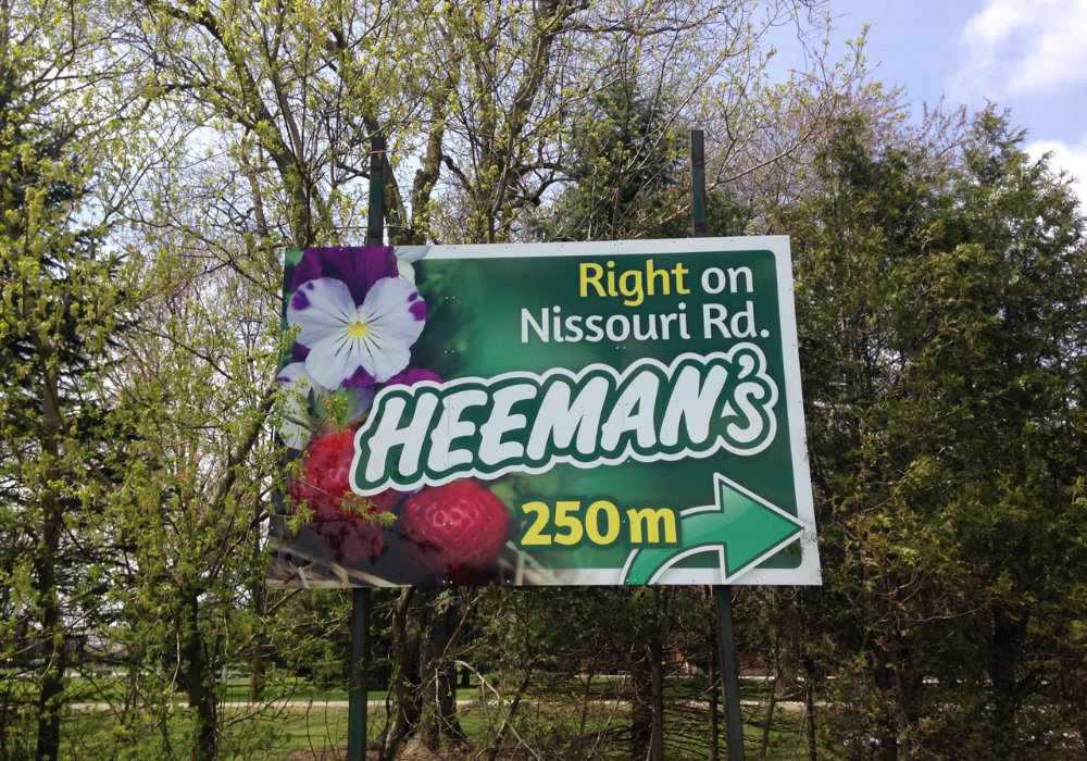
Order and wayfinding
When customers know where to go, they relax. When they don’t, they feel like they might make a mistake.
Even basic cues can change behaviour:
- A clear “Enter here” sign
- A pickup point label
- Directional arrows that aren’t an afterthought
You’re not just decorating. You’re removing uncertainty.
Proof without bragging
People want confirmation they’re choosing a real, competent business. You can show proof without sounding salesy.
Trust signals that work well visually:
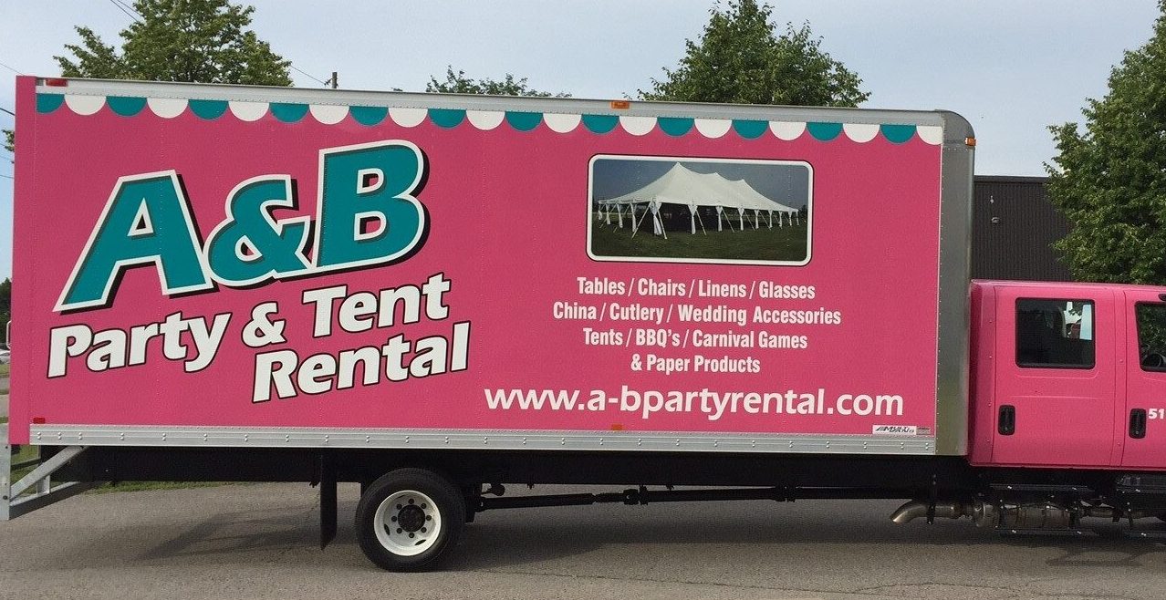
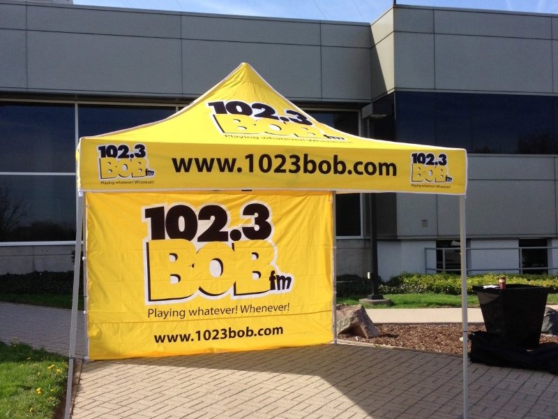
- “Serving the community since…”
- Simple service categories (“Vehicle graphics”, “Indoor signage”, “Trade show displays”)
- One short line about turnaround or process, if you can support it
The key is restraint. One proof point is stronger than six.
When growth breaks your branding
Most businesses don’t “mess up” branding. They outgrow it.
You add services. You hire more people. You take on bigger clients. Then the visuals lag behind because the old pieces still function, even if they don’t fit anymore.
The patchwork problem
Patchwork branding looks like:
- New logo on the website, old logo on the door
- Upgraded exterior sign, but interior posters feel DIY
- Different tones on different materials
- Seasonal graphics that look temporary, even when your business isn’t
Customers read patchwork as “in progress.” That can be fine for a pop-up. It’s not ideal when you’re selling expertise, quality, or reliability.
Updating without starting over
A smart refresh keeps what’s working and fixes what’s confusing.
Strong “refresh” moves:
- Standardize fonts and colours across your most visible pieces
- Replace the most dated items first (often the entrance and windows)
- Create a simple system for future updates so it doesn’t drift again
This approach respects your budget and still changes perception fast.
How to make visuals feel intentional
“Intentional” is not a word customers usually say, but it is something they notice immediately. A space feels considered when every visual element supports the same message rather than competing for attention.
This happens when visuals stay aligned at each point of contact. From the street, it is clear what the business offers. At the door, it is obvious where to go. Inside, the environment reinforces the expectation set outside.
When demonstrating what this level of consistency looks like in practice, real examples help. A well-presented portfolio allows prospects to visualize the outcome and understand what is achievable. Artcal’s project gallery shows how cohesive visual branding comes together across different spaces: see our work.
Next step: see what’s possible, then get a quote
If your business has grown but your branding hasn’t caught up, you don’t need to rebuild everything. You need a clear plan.
Start with the entrance and the first ten feet inside. Those are your trust zone. When those cues feel consistent, people stop hesitating and start engaging.
If you’d like help identifying what to change first, reach out to Artcal and share a few photos of your storefront or space. The fastest way to get moving is to contact Artcal and describe your goal: more walk-ins, more enquiries, or a more polished brand presence.
FAQs
What is visual branding for a small business?
It’s the set of visible cues that shape how people perceive your business, including signage, colours, typography, printed materials, and the overall look of your space.
How does branding build customer trust?
Customers trust businesses that feel clear and consistent. When people can quickly understand what you offer and your visuals match across touchpoints, they feel more confident entering and buying.
What should I fix first if people hesitate to come in?
Start with clarity: a readable storefront message and an obvious next step. Then reduce clutter and align the most visible pieces so your space feels organized.
Do I need a full rebrand to look more professional?
Often, no. Many businesses get big gains by standardizing key elements (fonts, colours, signage layout) and updating the entrance and windows first.
How do I know if my branding is outdated?
If different parts of your space look like they came from different time periods, or customers frequently ask basic questions (where to go, what you offer), your visuals may be creating uncertainty.